

Tactile and Emotive Graphic Design from Design&Practice
From magazines and menus, business cards and posters, to labels, signage, and hoardings; to the imagery splashed across our screens–the presence of graphics that represent brands is everywhere. While the inner-workings of graphic design studios and creative production houses–who are tasked with creating logos and identities for these brands, and shaping their 'branding' so to speak–are foreign to most of us, what is easy to discern, is the impact of compelling and emotive design.
Rising above rigid rules or trends in these disciplines–in typography, graphic design and more–good design simply captures the soul of a brand, a project, or an event. To us, at MaterialDriven, the most memorable works from the world of graphic design, brand identity and more, are those which break free of the inherent two-dimensionality of the disciplines to become tangible, tactile even, and truly three-dimensional–even when their physical format is static or two-dimensional, and experienced through a screen.
A studio that creates precisely such exceptional and impactful design, to our mind, is Amsterdam-based Design&Practice. Led by designers Golnar Roshan and Ruben de la Rive Box, the studio generates strategic and emotive brand identities, as well as tactile graphic design for its clients.
From textured print and packaging design to innovative patterns and rich surfaces crafted for interior design, and finally to iconic brand identities–the studio employs graphic design in all of its work in ways that are untethered to any single discipline, nor bound by any canonical rules.
The studio's output consists of a broad range of visually and haptically stimulating design. On the one hand is their design of brand identities and subsequent crafting of printed material (including packaging and stationery) for legendary clients such as designer Tom Dixon, Wedgwood, and Harper's Bazaar Cafe. On the other hand, are the specific and bespoke identities the studio has created for unique events and exhibitions at Maison et Object, Musée des Arts Décoratif, the Aram Gallery and more.

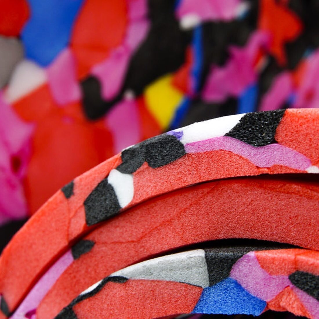
Tactile Brand and Invite design for the Electro Craft Show, by Design&Practice
Two personal favorites, for us, are Design&Practice's vision for the Tord Boontje curated 'Electro Craft' exhibition (seen above and below), held at the London Design Festival last year, and their iconic visualization of 'Joints & Bones'–a landmark exhibition held at the Aram Gallery in 2016.
Tactile Brand and Invite design for the Electro Craft Show, by Design&Practice
For Electro Craft–an exhibit showcasing contemporary craft that gracefully folds within it electricity and elements of technology–Design&Practice perfectly captured the prickly, electrically-charged, and hyper-interactive nature of the exhibition and its many designer-participants. Their efforts took the form of a language of custom icons, and dynamic, layered graphics, which were seen in the invites, handouts, and branding for the exhibition.
For Joints & Bones at the Aram Gallery–an exhibition showcasing innovation in joinery and detailing within contemporary product and interior design–the studio pulled the theme of joints and bones into their realm of graphic design and typography. The event's identity was hinged around joint-typography and a visible grid–the 'backbone' of graphic design so to speak. Seen on printed posters, signage and on screens, the event's identity seemed to possess joints and bones of its own, at once resonating with the objects in the exhibition.

Brand and Invite design for Joints + Bones at the Aram Gallery, by Design&Practice
The extremely rare, tangible, and physically-inspired nature of Design&Practice's works is no coincidence. What sets them apart, perhaps, is the fact they have one foot in the gritty and material world of product and interior design themselves.
Designers Golnar and Ruben also lead a second, twin design studio–Rive Roshan. This prestigious studio operates on the cusp of product and interior design, creating experimental work ranging from graphically printed silk scarves to shaded tea towels, to dramatic flowing tapestries and dynamic site-specific installations several stories high. The studio is marked by its generation of new object typologies, and also by its poetic folding-in of concepts of culture.
The experimental and research-driven efforts of the duo at Rive Roshan feed into their work at Design & Practice as well, and the two studios share and an emphasis on color, materiality and human engagement as key drivers of the design process.
Beyond this, a unique process seems to drive projects by Design&Practice–namely the creation of a concept or vision for its clients which draws from research on both the heritage and envisioned future of a project and its context. In translating this vision into reality, the studio adopts methods that no other graphic-design studio does–often working intensely with their hands to test and understand the impact of materials, transparencies, hues, and visual effects–even when the results are intended to be purely digital in their use.
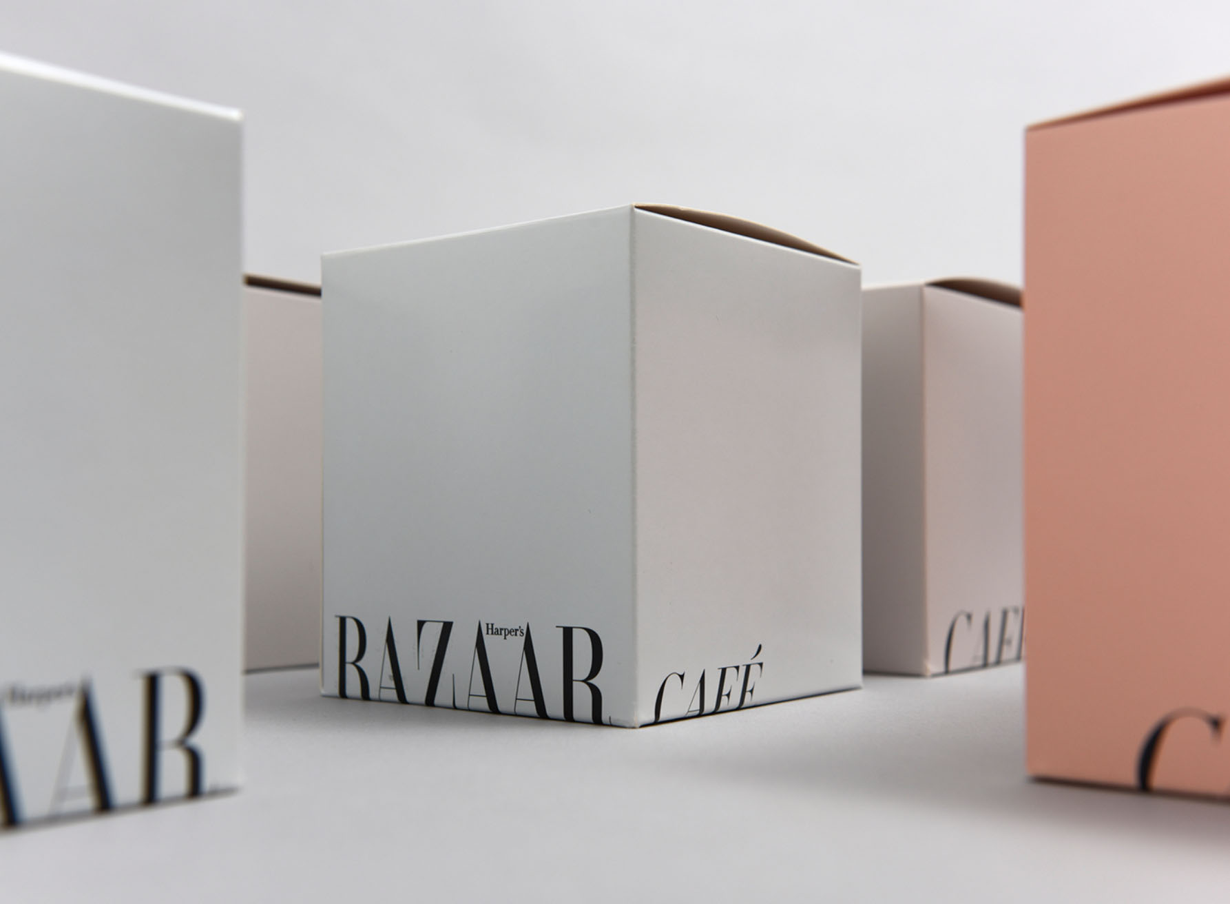
Identity and Packaging design for Harper's Bazaar Cafe by Design&Practice
Design&Practice's most recent project appears to brings their tactile graphics and strategic brand identity design to a new high. The redesign of Le Drugstore, a brasserie embedded within the iconic Publicis Drugstore on the Avenue des Champs-Élysées in Paris, was a project that the studio was invited to work on last year, along with Tom Dixon Studio.
Le Drugstore first opened its doors in 1958, when the founder of the Publicis Groupe (the multinational advertising company), Marcel Bleustein-Blanchet decided to introduce Parisians to the culture of the American convenience store, bar, and typical diner. For the revamped restaurant, which opened in summer of 2017, Design&Practice have created a timeless and iconic identity, which reflects in the restaurant's printed stationery, dossier-style menus, and bold wayfinding and signage.
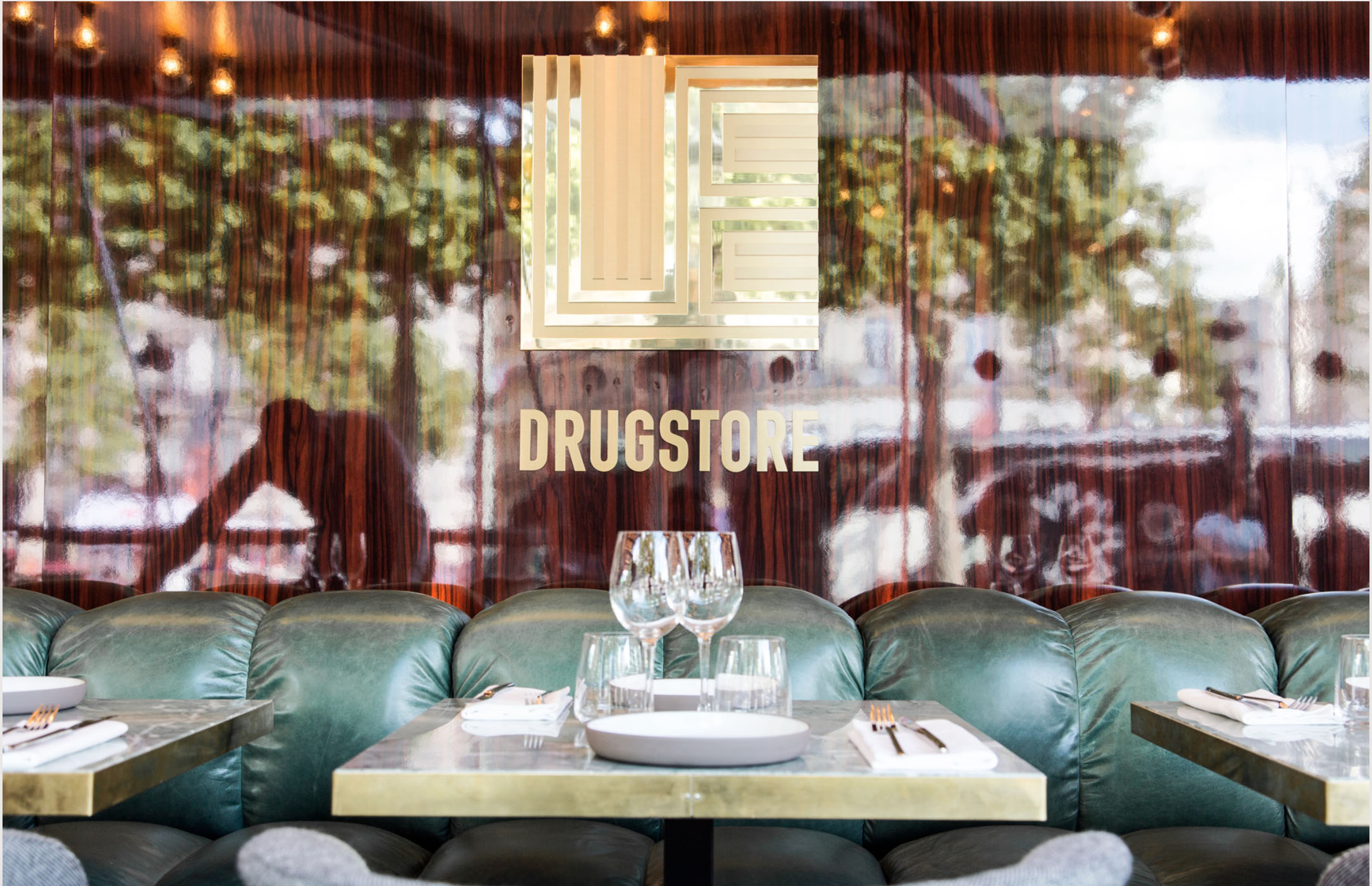
Brand Identity for Le Drugstore, Paris, by Design&Practice
The concept of a 'Drugstore,' while common in America, was and remains particularly unfamiliar to Paris. The idea of a 'Luxury Convenience Store' is even more of a novelty. It was this concept, and the desire to introduce diners to a unique experience, unlike what the Parisian restaurant-scape offers today, that became pivotal for Design&Practice, as they molded a new identity for the restaurant.
Along with the history of the Publicis Drugstore and its restaurant–a late-night attraction in the city, Design&Practice drew clues from the American Mad-Men era, and what drug stores and diners meant to American culture. The result is an unexpected pairing of luxurious, tactile materials with the forms of everyday convenience-store items such as folders and dossiers. Straightforward, bold typography and clean lines were united with materials of exceptional quality–giving rise to printed material and stationery for the restaurant that is both opulent and simple at once.
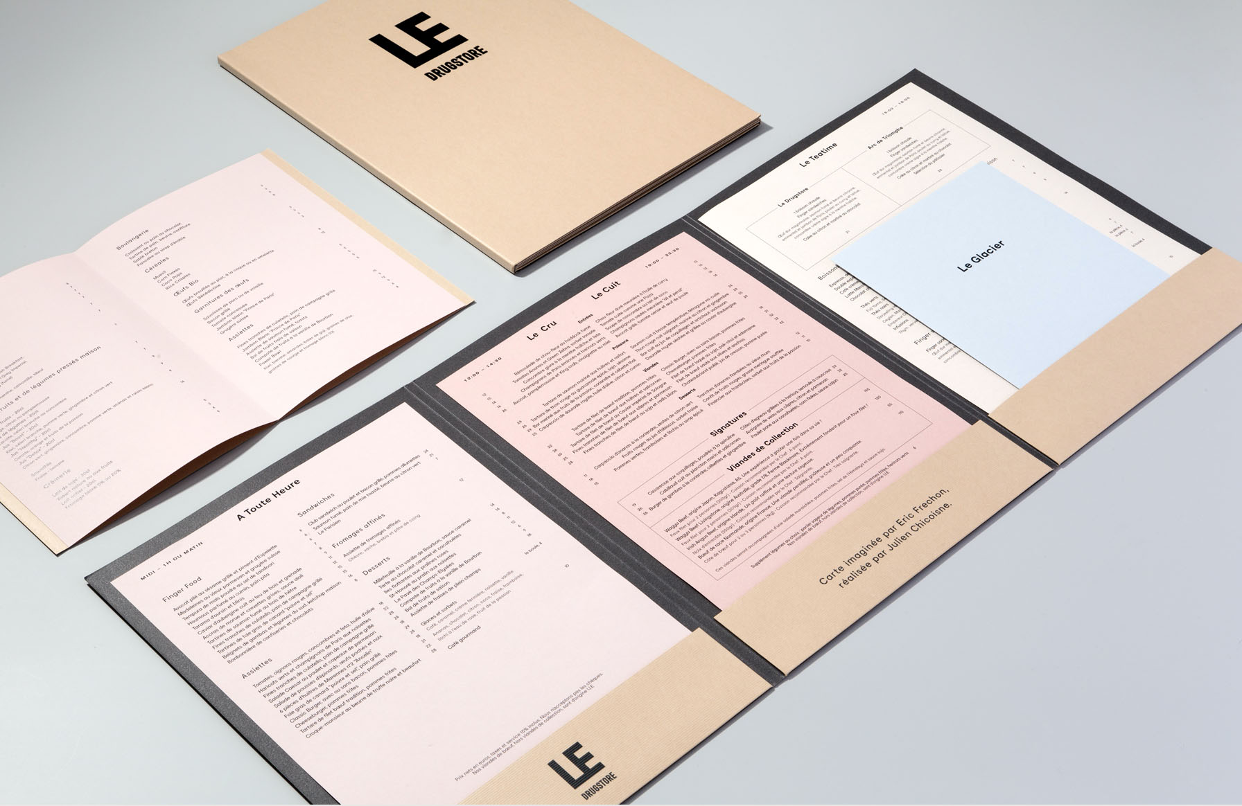
Dossier style menus and Brand Identity for Le Drugstore, Paris, by Design&Practice
A key element of the restaurant's new branding seems to be the magnification of the word 'Le.' Since the prefix 'Le' caps every foreign language word introduced into French, the studio decided to highlight this simplest of French words–Le-at the most iconic of the Paris' locations.
All in all, the dossier-style menus, the packaging, leaflets, cards and beautiful brass signage at the restaurant all speak to both the past and future of its rare context–a luxury convenience store in Paris. Design&Practice have managed to capture the uniqueness of this idea and experience in physical form. Using materiality, color, and bold typography as their tools, and history and future as their reference points, their graphic design becomes a vital part of the physical experience of the restaurant and helps shape its timeless identity.
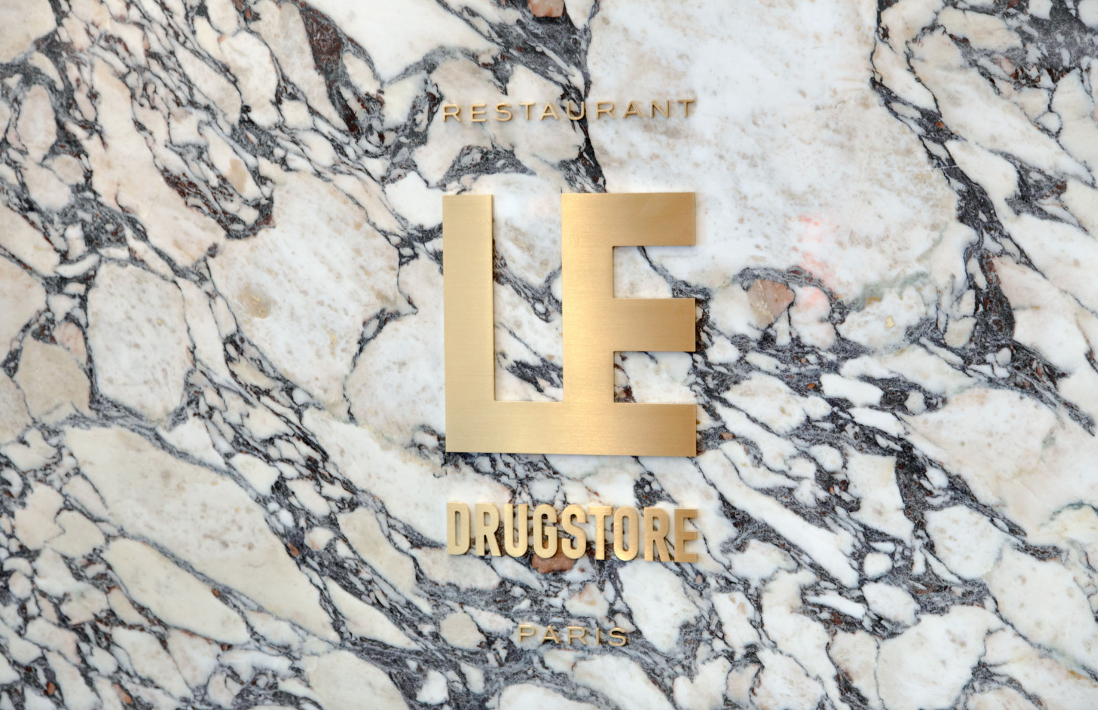
Signage and Brand Identity for Le Drugstore, Paris, by Design&Practice
To learn more about the transdisciplinary projects by Design&Practice, as well as the myriad ways to work with them, follow the link to the pages of their two studios.

![From Potato Waste to Industry Staple: Chip[s]Board](https://images.squarespace-cdn.com/content/v1/570a8015f699bb7295b31415/1512493196292-WZYXC6CE9ABLSPF0U5MK/Sm2_SAT%2BManufactory_30_Bes%2BPrice.jpg)